Cycling and Science as Guideposts for Setting Compensation
What do a flock of geese, a school of dolphins, a peloton of cyclists and compensation levels for named executive officers (NEOs) have in common? Perhaps a lot more than you’d imagine.
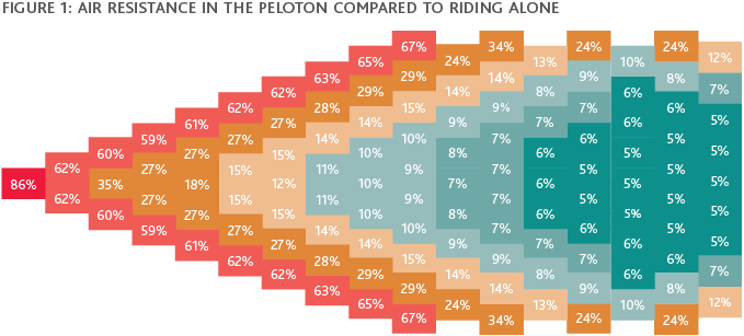
An academic study from the Eindhoven University of Technology of empirical data and simulations quantified the actual amount of air resistance in a peloton. In cycling, teams form a peloton which consists of a leader, with the remaining riders responsible for doing what they do best, whether that’s getting stage wins, accumulating points or going for the overall win. The best teams have many great riders, allowing them to rotate who leads and conserving strength for the sprints. The leader of the peloton experiences 14% less wind resistance, whereas riders in the back of the peloton experience 95% less resistance than if cycling alone.
Similarly, mother nature presents examples of species that have mastered the ability to draft (in the sense of pull or draw) from one another. Geese and dolphins, respectively, fly and swim in formations in which the leaders benefit from the efforts of the “team” behind them.
Can the empirical data from the scientific study on the peloton be extrapolated to organizational hierarchy as well (i.e., should the relationship between roles in the company and the rewards or compensation paid for those roles more closely mirror a peloton)? Can a parallel be drawn between the “draft” in the peloton and CEO compensation compared to other NEOs in the organization?
BDO and ClearBridge Compensation Group decided to find out by empirically studying compensation data in a similar fashion.
Leadership of the Peloton and Compensation (as a Reduction from the Leader)
Visually, the peloton resembles an organizational hierarchy (see Figure 1). As in a peloton, leading an organization is demanding, and the leader always faces resistance—more than other individuals face in the organizational hierarchy. Yet, leading with a team is 14% easier than going it alone.

Source: Eindhoven University of Technology Study
Translating the empirical peloton data into an organizational hierarchy, we arrived at three tiers:
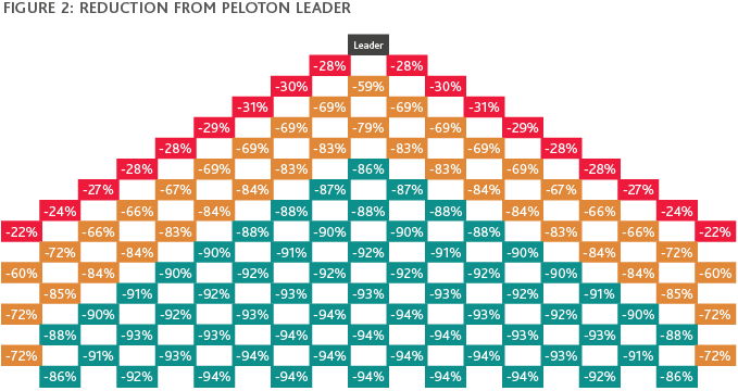
- Red representing direct reports to the CEO (0.22–0.28 reduction) – TIER 2
- Yellow representing 2 levels below the CEO (0.59–0.85 reduction) – TIER 3
- Green representing 3 levels below the CEO (0.86–0.94 reduction) – TIER 4

Source: Eindhoven University of Technology Study
Given these tiers of organizational groupings, empirical data on pelotons could suggest that if the CEO receives $1 million, the compensation ranges for NEOs should be set based on the reduction shown in Figure 2; in which case, as shown in Figure 3, Tier 2 executive average salary would be 72.5% of the CEO’s $1 million. Individuals in Tiers 2 and 3 would be paid substantially less (25.6% and 8.6%, respectively) in keeping with their positions in the organizational hierarchy. All data is theoretical and implies that the scientific data of wind drag could be indicative of theoretical compensation levels.

Some organizations and business models are flatter in hierarchy, while others are steeper than the traditional peloton. To test the theory, traditional organizational hierarchies (similar to a peloton) need between 100 to 200 employees. The peloton maximizing energy efficiency includes 121 riders.
This article focuses on the NEOs who are generally direct reports to the CEO (i.e., Red Tier 2 in the sample above).
Applying the Theory to Major Public Companies
To assess the relationship between organizational hierarchy and compensation, we studied the broad market pay practices among CEOs and their direct reports, focusing on each pay element for the companies within the Russell 3000 (see the Methodology section for more detail). When assessing how each company compared to the peloton structure, we bifurcated the Russell 3000 into those that meet the peloton structure (i.e., NEO average pay representing 65% to 85% of the CEO) and those that do not.
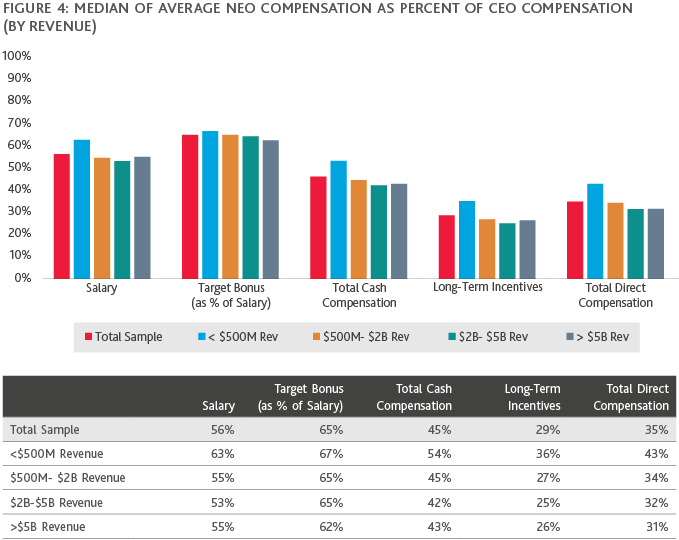
Figure 4 shows the median average NEO compensation as a percentage of CEO compensation based on company revenue. Key takeaways include:
- The gap between CEO and NEO compensation increases with company size, regardless of industry.
- Target bonus as a percent of salary closely mirrored the peloton structure.
- Long-term incentive compensation was most removed from the peloton structure.

Figure 5 shows three-year TSR (total shareholder return) performance for companies that met the peloton structure versus those that did not. Key takeaways include:
- Only 4% of companies follow the peloton structure for total direct compensation.
- Based on total direct compensation, the 4% of companies that follow the peloton structure delivered 53% higher three-year TSR compared to companies that did not meet the peloton structure.
- Companies that met the peloton structure were generally smaller based on revenue and market cap.

What Does This Mean?
The data implies that the larger the company, the greater the gap between CEO compensation and that of direct reports. The increase in this “gap” between the CEO and the other direct reports could be caused by a variety of factors, including the CEO’s individual profile increasing / having more exposure at larger companies, as well as a limited talent pool for CEOs who have run similar sized companies or larger. These factors likely contributed to these companies being further removed from the peloton structure.
Going forward, companies should consider assessing their compensation trends over time, and determine if the relationship between the CEO’s compensation relative to the other direct reports aligns with the company’s intended compensation philosophy. While it is only one data point, the study implied that the companies that fell within the peloton structure for total direct compensation significantly outperformed those that did not based on relative TSR. Instinctively, this finding “felt right” and wasn’t all that surprising, as when thinking about an organizational hierarchy, having a strong management team behind the CEO, strong succession planning and retention tools should lead to better continuity and shareholder value creation over the long-term.
Where Do We Go from Here?
What can we learn from the peloton structure when applied to organizations and compensation? Is the theory just kind of cool or does it have practical application for executive compensation design? Do the resistance numbers translate to other forms of leadership? Can we apply the learnings to building professional careers in a hierarchical organization?
The answers may lie in close observation of mother nature and using science to understand, quantify and apply its messages.
Methodology
- We chose the Russell 3000 as the data set to determine whether the CEO/Tier 1 relationship mirrored the expected reduction. Our data represented compensation of Russell 3000 companies’ NEOs from the companies’ most recent proxies sourced from a database of publicly available filings at the time of the analysis.
- We scrubbed out any companies that didn’t pay all five compensation elements or had atypical pay practices. We ended up with 2,281 companies in the sample.
- We calculated average compensation by element for the second through the fifth highest paid NEOs as a percentage of CEO compensation. We defined companies with a “peloton structure” by compensation element as companies with average NEO compensation between 65% and 85% of CEO compensation.
- To create a comparison to the peloton structure, we looked at compensation by each element relative to the CEO.
SHARE